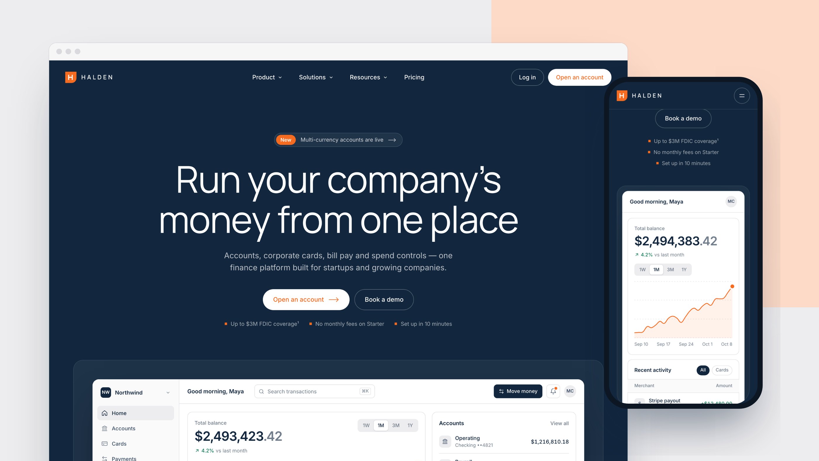
A launch-ready marketing site for a business-banking platform — where the product sells itself through motion.
Halden is a business-banking platform for startups and growing companies — accounts, corporate cards, bill pay and spend controls in one place. I built it as a concept brand to show how I take a fintech product from brief to launch: positioning and copy, visual identity, interaction design and a production-ready front-end.
Most fintech landing pages look alike: a static dashboard screenshot, three feature cards and a logo strip. The goal was a site that feels as trustworthy as a bank and as alive as the product — one that shows what the software does instead of describing it, and still loads fast and reads well on a phone.
The hero is the product. Instead of a screenshot, the dashboard is a working interface: new transactions arrive every few seconds, the balance and chart update, notifications fire and card limits fill up. It arrives tilted in 3D and settles flat as you scroll.
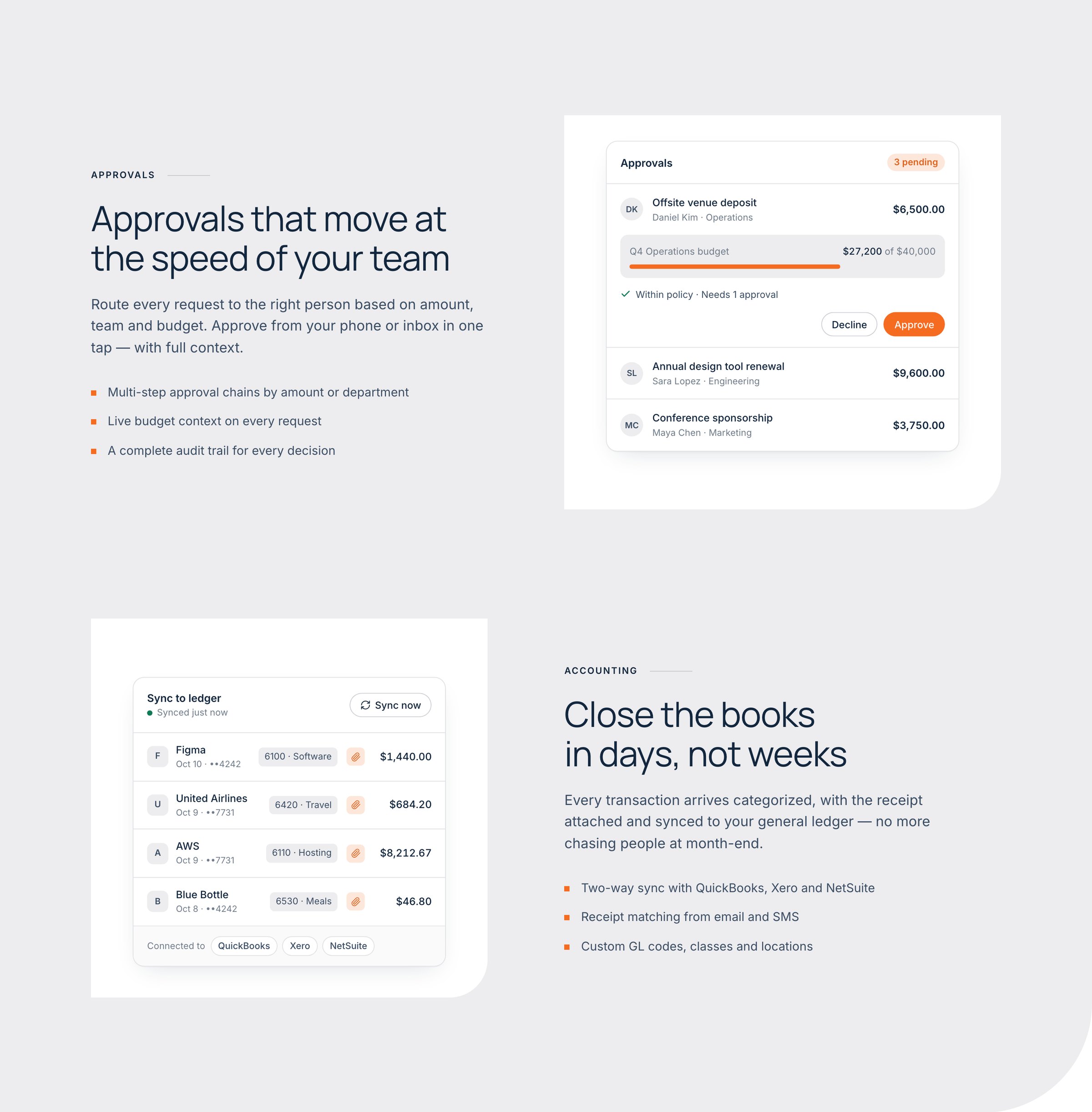
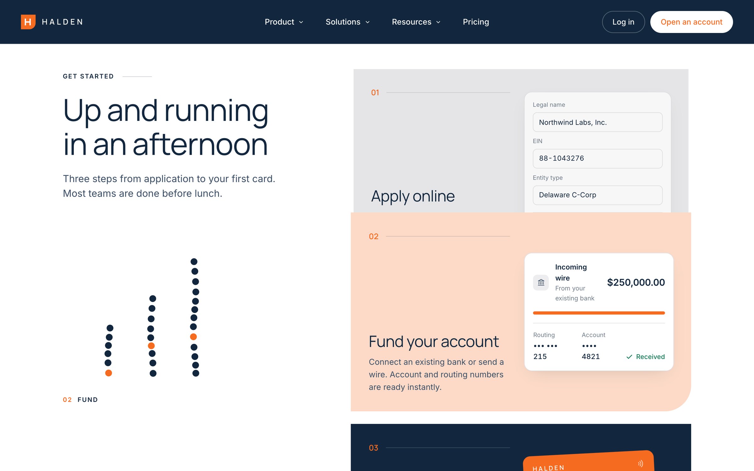
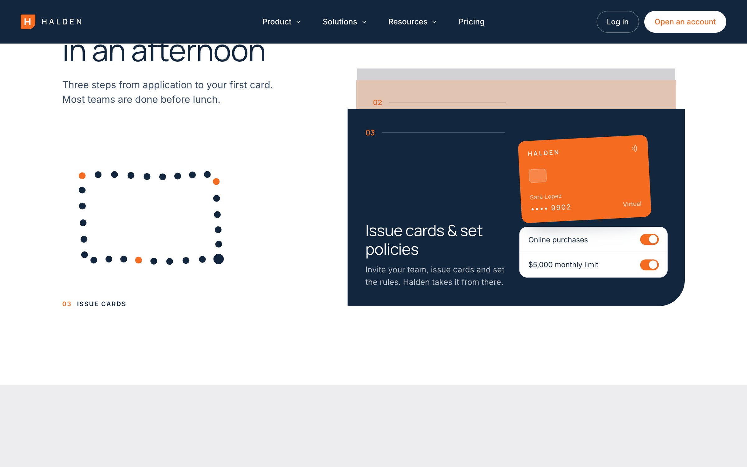
Every section below has one job and one interaction. Spend rules switch themselves on, a cursor approves a pending request against a live budget, the ledger syncs row by row, and a dot illustration morphs from ring to bar chart to card as the onboarding steps stack up. Manrope and Inter, a navy and orange palette and a single rounded corner carry the identity through cards, sections and buttons.
Smooth scrolling, word-by-word headline reveals, sticky stacking cards, a testimonial that lights up as you read and counters that land on the numbers that matter. Apart from Lenis for smooth scrolling, it's all hand-written in vanilla JavaScript and CSS, and visitors who prefer reduced motion get a calm, static version.
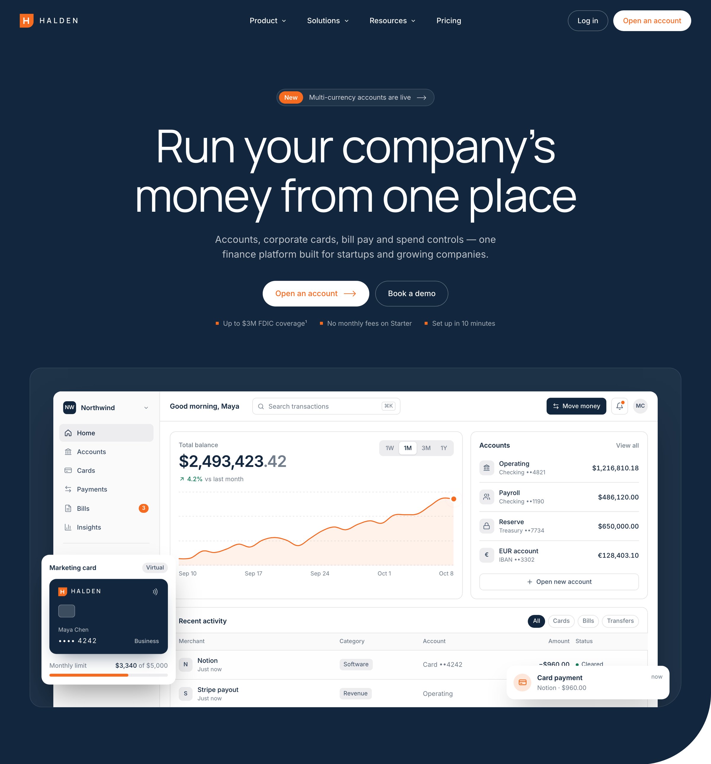
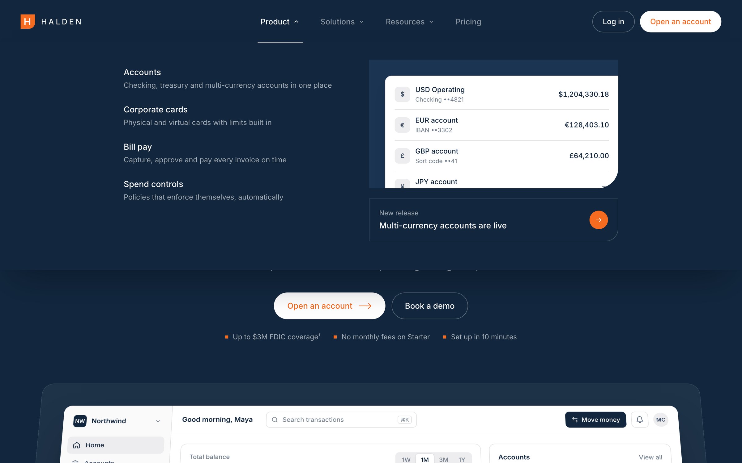
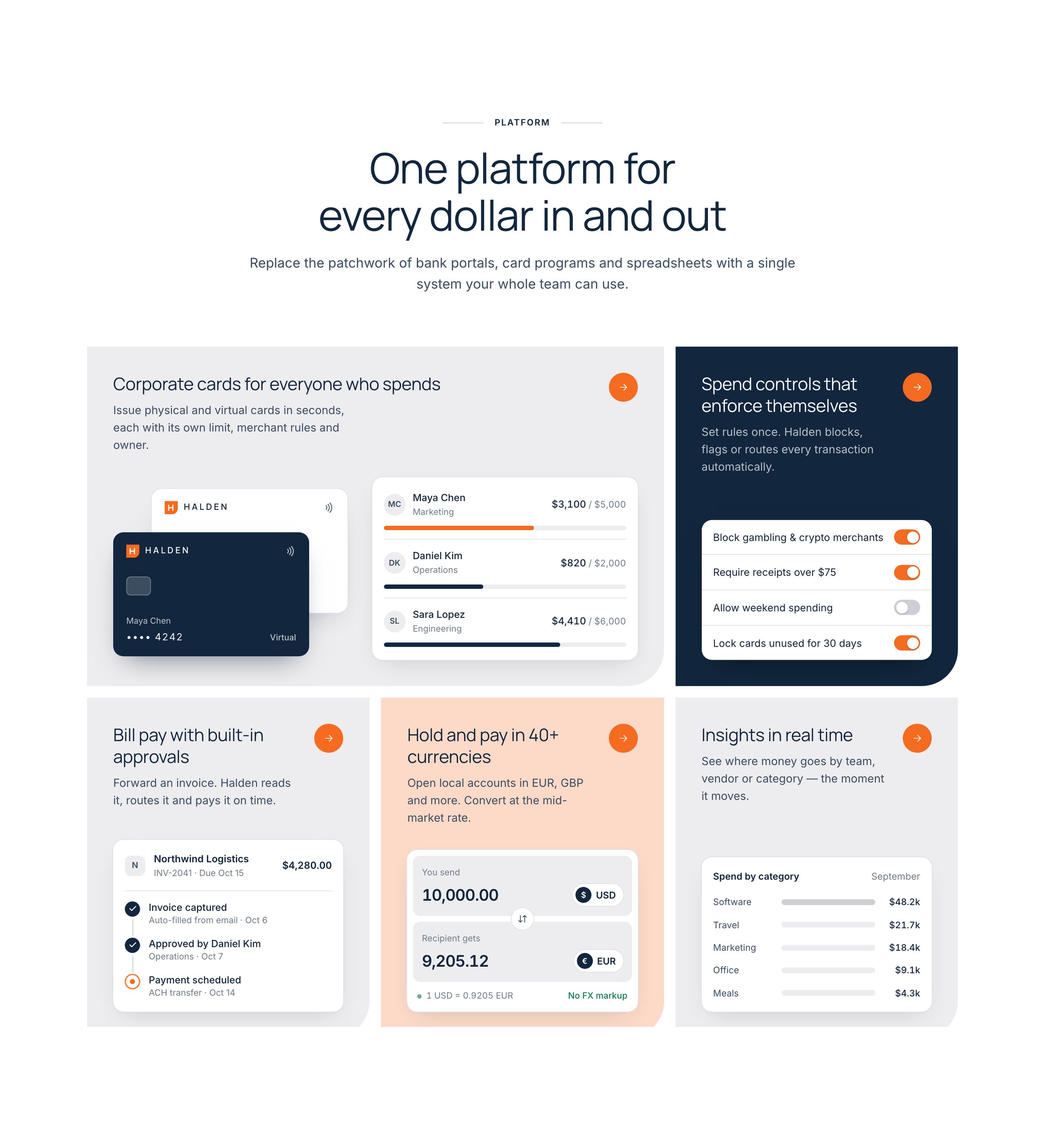
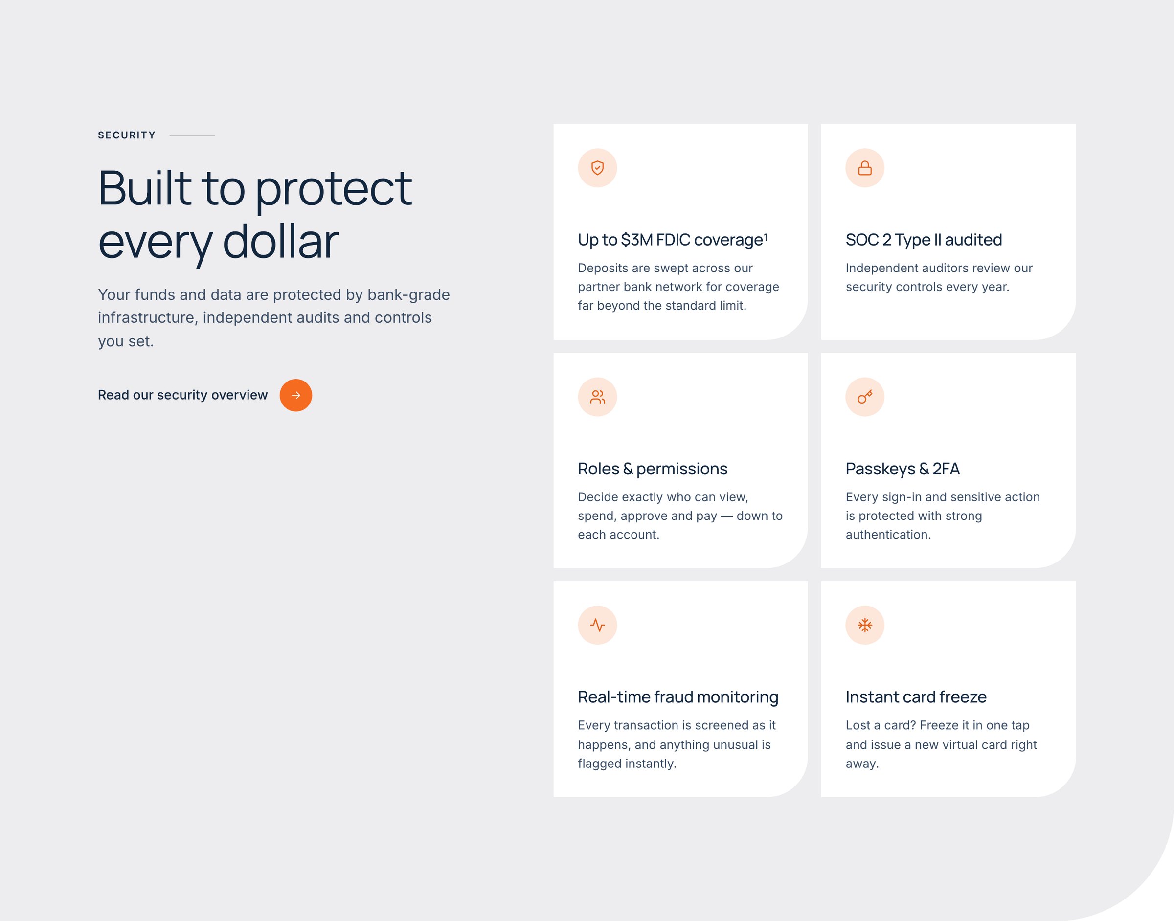
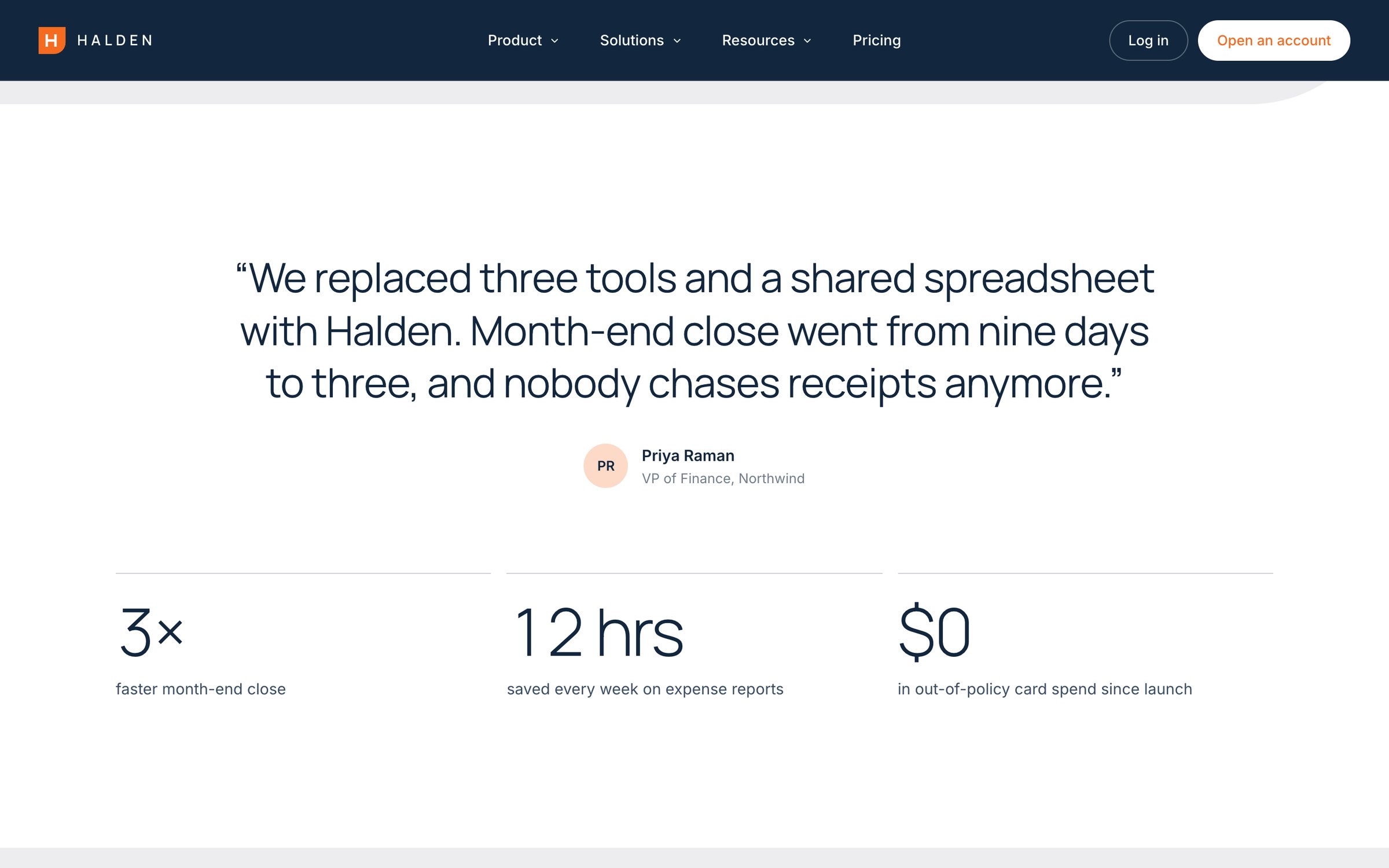
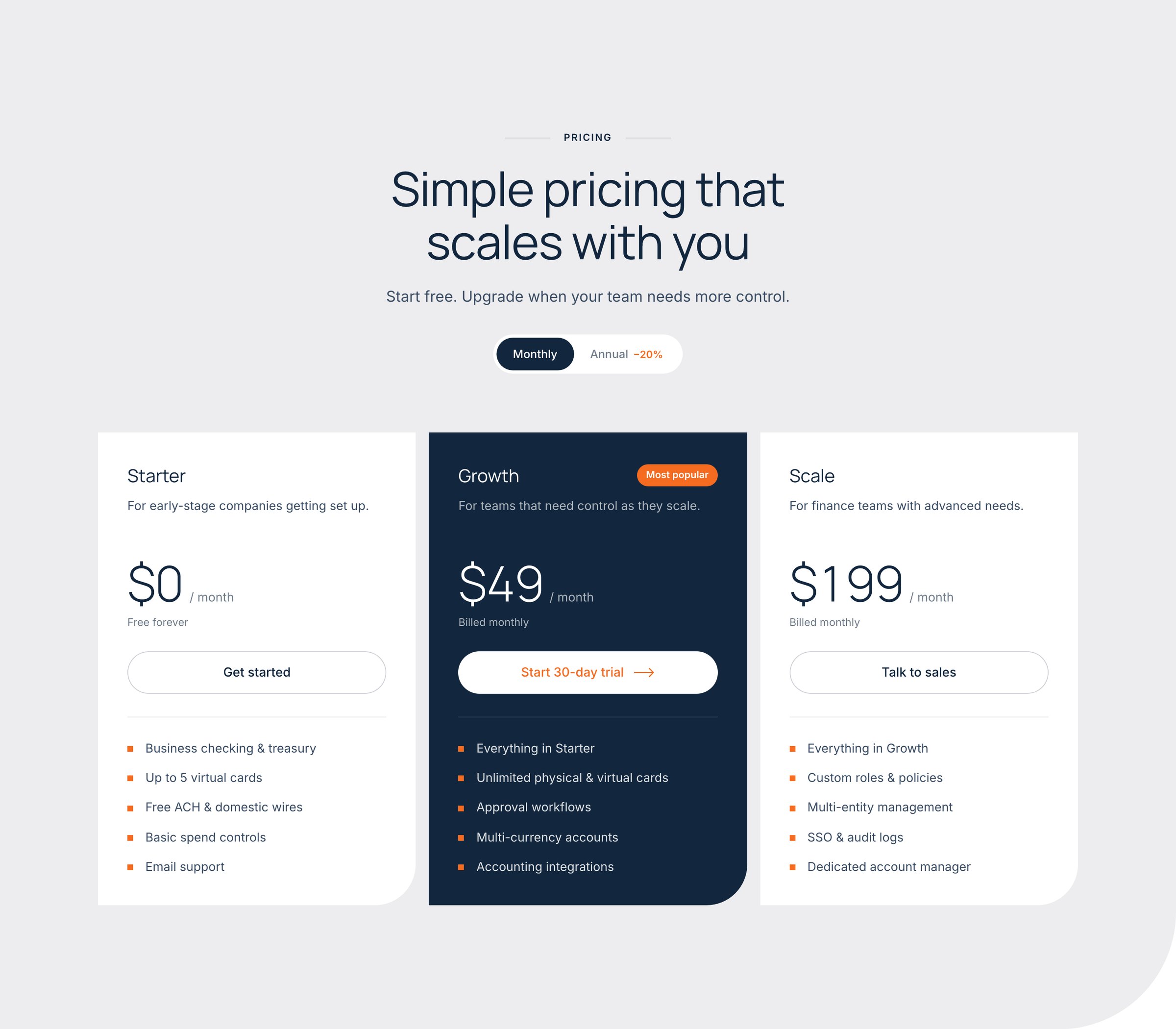
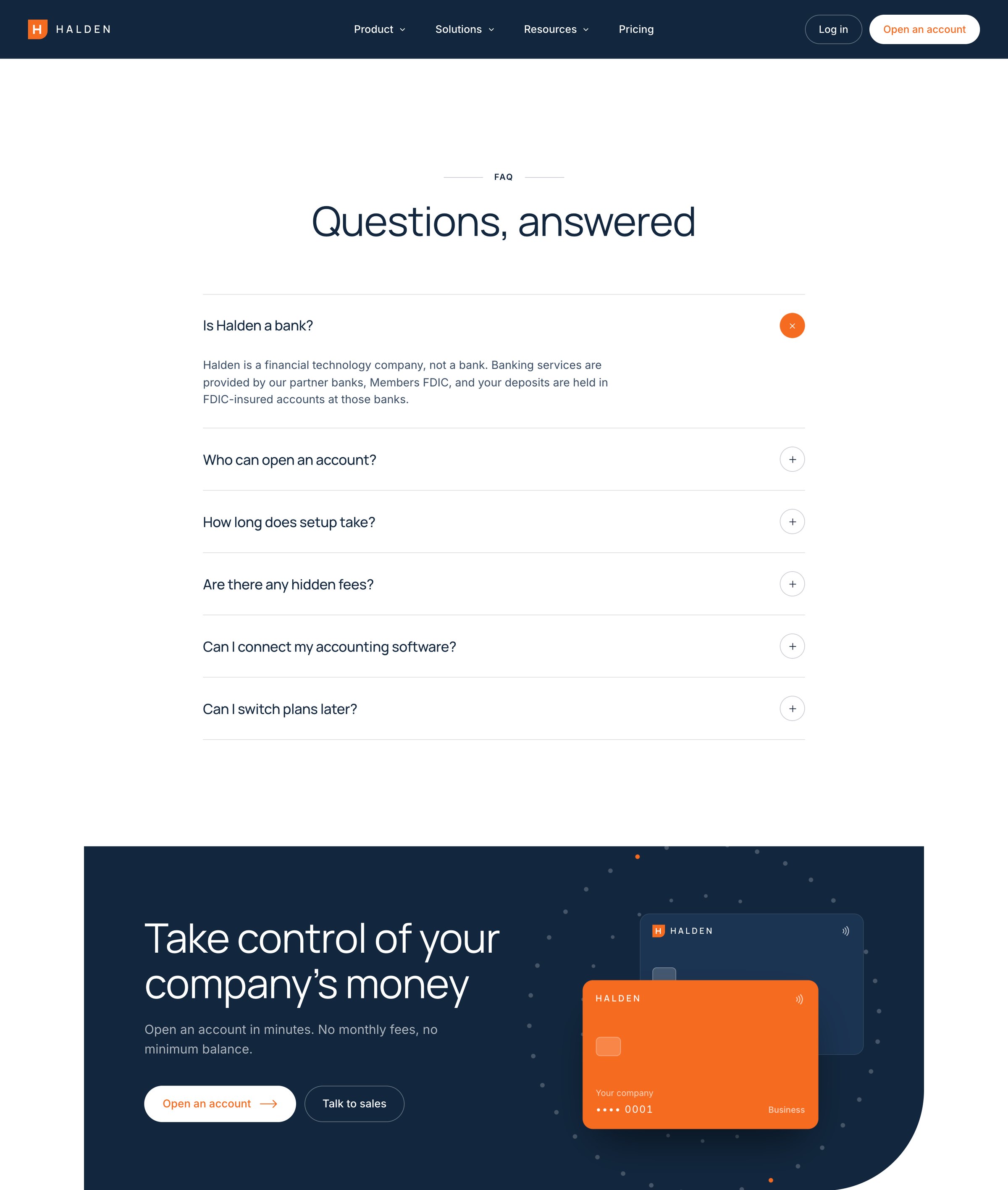
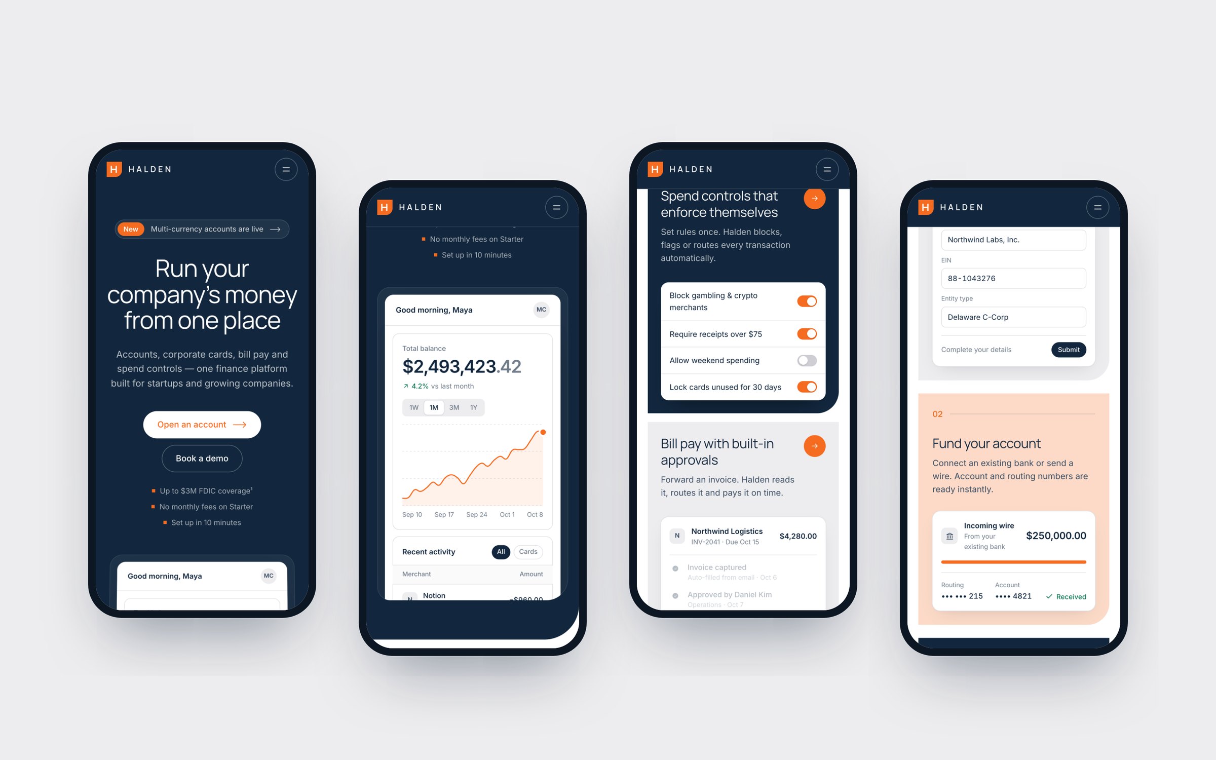
A complete, responsive marketing site — mega-menu navigation, live product hero, feature bento, workflows, onboarding, security, social proof, pricing, FAQ and CTA — built framework-free and ready to move into Framer or any CMS.